Το ελληνικό βιβλίο. Μια ιστορία 540 ετών | dimart
Υποβολή σχολίου

It’s been said by the likes of Gandhi, Samuel Johnson, and Pope John Paul II that the true measure of a society is how it treats the least of its members. The same can be said for a typeface.
Great design is a matter of seemingly insignificant details. When a typographer draws her glyphs, she does well to take into account not just the shape of the letter, but the kerning of her new alphabet and the varying weight of strokes. Letters are no simple things: They come with a lot of required parts, and when putting them together type designers have to strike a balance between their own creative ethos and a font’s potential uses.

Often, typographers will sneak a little more personality than other letters can afford into those glyphs utilized less often. Chief among these is the ampersand—the andsymbol tucked away above the 7 on your keyboard—which is rarely used outside of logos (including our own in the DWRL!) and so can be an opportunity for typographersto add some flourish to an otherwise dry script.


It’s understandable that the ampersand has come to embody a typographic sense of play, considering that the logogram is the result of a dual corruption. The image as we know it originated as a ligature (two letters connected in a single glyph) of the Latin word et, which in English became and; look hard enough and you can still see a capital E and T, and some typefaces try to draw attention to this origin.
As for the strange name, it stems from an archaic means of learning the alphabet. Schoolchildren would add the Latin phrase per se to letters that could stand alone as a word—i.e.,A or I—so that a recitation exercise would sound something like, “A per se A, B, C, D…” (which pretty much ruins the melody of the nursery rhyme). When the student got to the end of the alphabet, it was accepted practice to include the then-more-common & ligature as a 27th letter—and because languages tend to drift as much as a child’s mind, “X, Y, Z, And per se And” eventually collapsed into ampersand.
Unsurprisingly, the birth of web design has seen a renewed interest in the ampersand. No longer relegated to the edge of a keyboard, you can find everyone’s favorite logogram on t-shirts, as tattoos—there was even a recent Tumblr project which involved designing a new ampersand every day for a year. In its very form, the playfulness of the ampersand seems to inspire amateurs and professionals alike to create new meaning, new connections, to say and in positive ways and exp& toward new horizons—such as the “Amperclan” of visual puns by artist Sophie Elinor:


Graphic designers have pushed the ampersand well beyond its use as a conjunction, transforming an archaic deformity into a symbol of digital art. In many ways and with many variations, the ampersand has come to epitomize the rhetorical possibilities of typography: The ability of a font, even a single glyph, to capture an ethos and create a feeling. From humble and mangled beginnings, the ampersand has come to represent the best parts of design, even if it’s one of the smallest parts per se.

We are writing more than ever before—in the US we send 6 billion text messages a day, while every minute Facebook users share nearly 2.5 million pieces of content, Twitter users tweet nearly 300,000 times, and email users send over 200 million messages. How often are we trying to convey emotion in those messages? How often does our messages get misinterpreted? How many people can recall a disagreement that happened because text is bad at conveying emotion? Can fonts convey emotions?
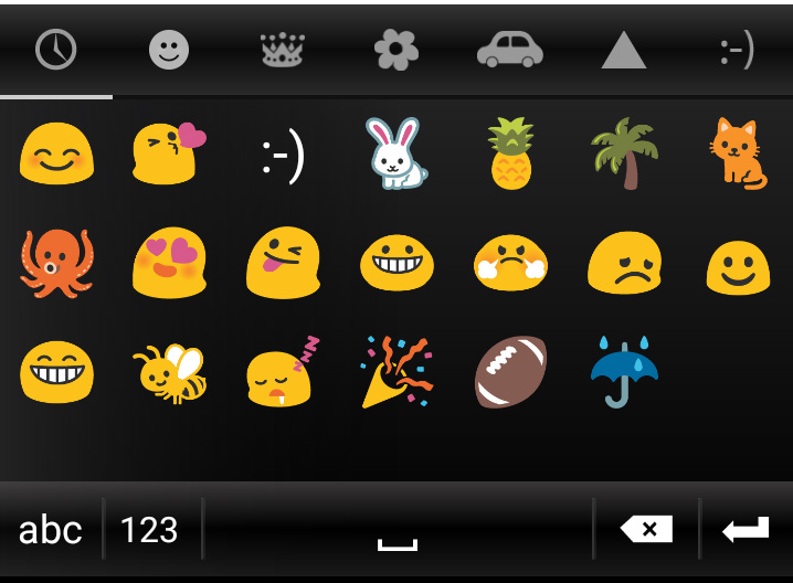
We have ways of conveying emotion in text. We use ALL CAPS TO YELL AT PEOPLE in text. Let them know you’re mad. I use commas, colons, semicolons, dashes, en dashes, and em dashes (just to name a few) to convey more meaning than the words alone. And I just used parentheses. Not to forget the emojis – those which are defaults in our messaging systems and those from early era chat rooms.
ASCII emoticons of the west
The smiley face
:- ) : ) : D :o) :] :3 :c) :> =] 8)
The frown
>:[ :- ( : ( :-c :c :-< :< :-[ :[ :{
My favorite, the rose
@}-;-‘—
ASCII emoticons of the east
Happy
(^v^) (^u^) (^◇^) ( ^)o(^ ) (^O^) (^o^) (^○^)
Sad/Crying
(‘_’) (/_;) (T_T) (;_;) (;_; (;_:) (;O;) (:_;) (ToT)
Amazed
(*_*) (*_*; (+_+) (@_@) (@_@。 (@_@;) \(◎o◎)/!
ASCII Art
And the cool new emojis on phones
Even the font we pick can have an impact on the readers. For example, in satirical readings Times New Roman is perceived as more funny and angry than Arial. While good mood and increased performance on cognitive can be induced by good type design(i.e., kerning, small caps, old style numerals, and sub/superscript features, symmetry as shown below). San-serif fonts are more viewed as more playful than serif fonts. There are many more example of popular press having an opinion on what the font says, and even on font evoking smells, but this is an area ripe for more concrete research done with experimental designs.

We went from spending more time talking to more time writing. With all of this writing, and more ways than ever to miscommunicate, we are also finding more ways to communicate emotion through text and font—in hopes of not being misunderstood.
via http://www.dwrl.utexas.edu/2015/10/12/what-does-the-font-say/
Previously in this space, I used the work of the late Adrian Frutiger to illustrate a particular way of thinking about typography. According to that view, a typeface is best when it goes unnoticed. Font is meant to invisibly transmit an writer’s point, without the letterforms interfering with either the author’s intent or the reader’s interpretation.
Responding to the advent of the personal computer during the late 1980s, in “The Electronic Word: Literary Study and the Digital Revolution” rhetorician Richard Lanham described this conventional way of (not) seeing type in prepositional terms:
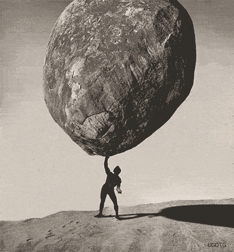
Look THROUGH a text and you are in the familiar world of the Newtonian Interlude, where facts were facts, the world just ‘out there,’ folks sincere central selves, and the best writing style dropped from the writer as ‘simply and directly as a stone falls to the ground,’ just as Thoreau counseled.
VIA DAILY TIMEWASTER
In contrast to such conventional visuality, Lanham argues that the “razzle-dazzle” affordances of digital texts flip upside down “our traditional notions of literary and cultural decorum.” While we still can read through a text to locate an author’s meaning, electronic interfaces encourage us to look AT the words themselves, recognizing how their surface materiality “is now a malleable and self-conscious one.” For Lanham,
The interactive reader of the electronic word incarnates the responsive reader of whom we make so much. Electronic readers can do all the things that are claimed for them—or choose not to do them. They can genuflect before the text or spit on its altar, add to a text or subtract from it, rearrange it, revise it, suffuse it with commentary.
VIA THE VIDEO FOR DAFT PUNK’S “TECHNOLOGIC“
In a word, digital texts—especially as they are metonymically typified by typographic plasticity—promote anew a rhetoricalrelationship to the acts of reading and writing. Here Lanham’s claim is complicated and counter to conventional wisdom, but in his eyes, digital technology enjoins users to take note of how our notes are written, to no longer take the means of writing for granted.With as many options as most word processors provide, a document’s typeface becomes as fundamental and important a choice as the title.
AN “ORNAMENTAL” FONT
Alright, maybe not as important as all that, but nonetheless necessary and informative. According to this take on type, font is not simply ornamental, but an indispensable part of writing. Hence the script you write in should call attention to itself in its relationship to the conveyed text, rather than trying for transparency.
Type is a type of rhetoric just as rhetoric is a matter of type. Writing—or, rather, in its digital form, typing with type in mind and in view allows authors and readers to literally see the contingent form of their praxis, that no text is simply self-evident without need of mediation. When typographic choices stand out, it complicates an ordinary understanding of closed meaning and suggests that ultimately everything is open to interpretation, to being seen differently.
via http://www.dwrl.utexas.edu/2015/10/20/two-types-of-type-part-ii/


